Wednesday, November 30, 2011

Location, Location, Location

image via the pink line project
Did you know that there are series of abandoned tunnels under Dupont Circle? D.C.'s original streetcar system was  put to rest in the early 1960's when buses became the newest form of public transportation. A couple of businesses have attempted to set up shop in the tunnels, including a food court called Dupont Down Under and a health club chain, but financial complications and city bureaucracy ultimately thwarted development. 
Now the Arts Coalition for the Dupont Underground has secured exclusive rights to a development plan, which will include gallery and performance spaces, along with a few boutique cafes slated to open as early as next spring! Although the plan will require formal letters of commitment and an estimated 15 million dollars in funding, the development board recently swore in Lionel Lynch, one of the key development consultants behind New York's wildly successful High Line.
New York's High Line transformation from abandoned trolley track to public park

I think that there is an allure to transformed spaces. They are nostalgic without being precious or stale, because they mix old memories with new life. (Think Glen Echo or the old Walter Reed Hospital that used to be a girls boarding school.) I can't wait for this new space!


Tuesday, November 29, 2011

If I hadn't become an artist, I think I might have studied cognitive science or neurobiology. As someone operating with a heavy right-brain lean in a left-brain dominant world, I am particularly interested in the interaction between the brain hemispheres. I love the fact that someone who is not musically inclined can listen to a piece of music with his right brain, while an expert musician switches seamlessly between his experiential right-brain and his analytical left-brain in hearing and categorizing particular notes. 
I spend a lot of my time in the studio listening to public radio as I paint. That way I can catch up on the news and hear interesting interviews as I work. (This post was inspired by one on Michael Gazzaniga’s new book, Who’s in Charge?, which addresses questions about the relationship between freewill and the mechanics of the human brain.) Anyway, I've noticed my style becoming a little tighter and cleaner in recent years, and I'm starting to wonder if what I'm listening to has any effect on how I'm painting. Namely, is listening to language arranged in logical constructs encouraging a more representational/ less abstract, inventive style? 
What do you think? Do you find that what you listen to affects the type of work that you do? I'm planning to bring my ipod to the studio tomorrow. I'll keep you posted on the results.

Monday, November 28, 2011

Monday Match: Collectors' Edition

{Every week I post an image of an interior that reminds me of a work of art either in its palette, composition or mood.}
The home of Hollister and Porter Hovey via Design Sponge
William Merritt Chase, The Studio Corner


* The Thanksgiving holiday is over and my neighbors are hanging up their Christmas lights. Every year I make grand plans for decluttering before I start flinging my tinsel. Then I see spaces like the Hovey home, or paintings like the one above and decide that there is something comforting about living amid piles of interesting things.

Friday, November 25, 2011

Art and Advertising

{"Publicity images often use sculptures or paintings to lend allure or authority to their own messages" - John Berger}

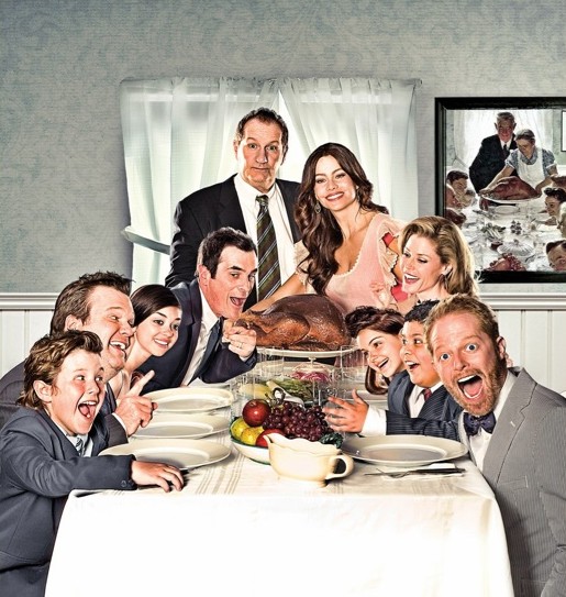
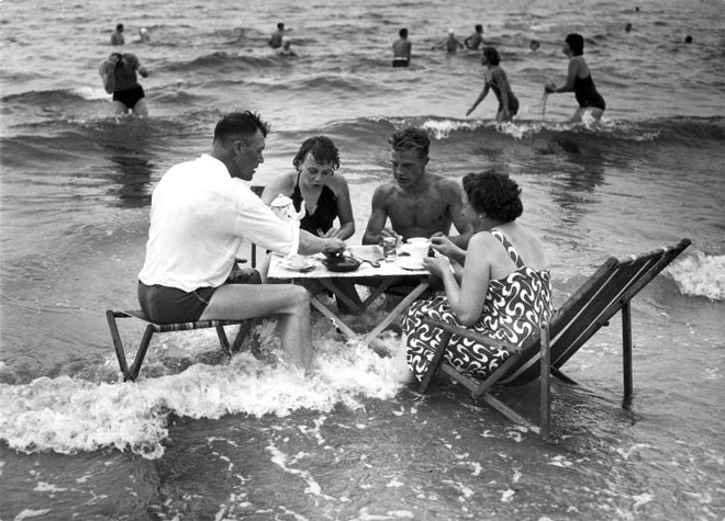
Whether your family looks like this
Norman Rockwell
or more like this
Modern Family
I hope that you all have a very happy Thanksgiving!

*Clearly this was intended to post yesterday. I hope that you had as much fun as we did here!

Wednesday, November 23, 2011


Hi, Friends! A few of you have e-mailed asking about where you can buy prints and greeting cards of my DC cityscapes. I sell prints and packs of five different (blank) cards and envelopes at the following Chevy Chase, DC locations:

*Periwinkle

3815 Livingston Street


*The Broad Branch Market
5608 Broad Branch Road

*Brook Taylor Interiors
On the corner of Brookville Road and Taylor Street 

All originals represented in the prints and cards have been sold. Of course, you can always make an appointment to visit my studio (39th and Northampton) to view a wider selection of my prints, or to discuss a commission of an original painting. I am booked through the winter holidays, but it never hurts to start thinking about Valentine's Day!

Tuesday, November 22, 2011

The Physicality of Sound


Imagine walking to the bus without being able to hear your shoes hitting the street, cars screeching silently by you. Christine Sun Kim lives in this world. She is a deaf performance artist who has decided to take ownership of sound, and I am FASCINATED by her!

Here's why: Real artists are explorers -- sometimes in the brave pioneer sense, but often in the messy utterly-focused way of children at play. Christine may or may not be setting out to create finished works of art, but her exploration is BEAUTIFUL! She records sounds and plays them back on specially-crafted machines attached to balloons, paint and neon string in order to examine the physicality of sound. Seriously friends, this one is worth watching!


My favorite quote: "I love creating feedback. It is my favorite sound."

Monday, November 21, 2011

Monday Match: Self Dissected Edition

{Every week I post an image of an interior that reminds me of a work of art either in its palette, composition or mood.}

 photo credit: Jean-Marc Palisse. Designer ?
Frida Kahlo, Le Due Frida
* This room reminds me of Kahlo's painting not only because of the obvious references to human organs, but also because of the mirror as a symbol of self reflection, and the two chairs (red and blue) as stand-ins for the two sides of oneself. I also like that Kahlo's palette is a keyed-up version of the interior's palette, and that both images include a set of outstretched hands.


Friday, November 18, 2011

Happy Friday!

 Happy Friday! What are you're plans?  I'm hoping for a little sunshine in the mornings as I work on a house portrait outdoors. Then I'm going to put on a big pot of tea and spend the afternoons writing long-over due thank you notes. Happy Weekend, Friends!

Add caption

Thursday, November 17, 2011

Wednesday, November 16, 2011

Art and Advertising

{John Berger's book Ways of Seeing claims that publicity relies on historical artistic references to sell products, because advertisements would lack credibility if they used a strictly contemporary language. In honor of this idea, I post an ad each week which references a particular work of art.}

Stanley Kubrick's masterpiece, 2001: A Space Odyssey

Advertisement for Amazon's Kindle (Illustrated by Billy Nunez)

Tuesday, November 15, 2011

Pretty Only Gets You So Far

At the book launch. Ignore my crazy eye. Let's call it my attempt at living out the book's message. Photo credit: Yulia Mikhalchuk.
 Last week, my sister invited me to join her (and our friend, Alissa) at a launch party for Deborah Needleman's new book, The Perfectly Imperfect Home. For those of you interested in design, you know that Deborah was the Founding Editor of the widely-hailed, yet-to-be-rivaled Domino Magazine, and is now Editor-in-Chief of The Wall Street Journal.
I have to admit that while I adored Domino, I bought her book a bit hesitantly. I am not an interior designer, and the thought of reading a whole book devoted to the subject sounded about as exciting as, well, probably as exciting as reading a technical painting guide sounds to all those non-artists out there. But friends, I read it cover to cover!
Deborah believes that homes should be deeply personal spaces -- that the little thoughtful quirks in our spaces are what breathes life and interest into them. I couldn't agree more. Pretty only gets you so far.
 We've all been in rooms that are so carefully constructed that we are terrified to upset the balance of a throw pillow. These are often spaces that are beautiful in the abstract, but stale and lifeless in reality. They beg for a backpack or a couple of pairs of boots flopped next to the door.
Kids rooms should look like kids live in them. Jenna Lyons sets a gorgeous fireplace off with dramatic paint and lets her son's toys handle the bulk of the design work. There is something sad looking about a perfectly manicured child's room.
This is a concept that extends to all forms of beauty. A model can have the most classically perfect face in the world, but it takes a distinct (often traditionally 'unattractive') feature to distinguish her as a true beauty. These are the faces we linger over and remember.
This J. Crew model wears her wrinkles and the gap between her front teeth like a badge of a well-lived life.
  We admire this or that fashion designer, but we swoon over those seemingly thrown-together outfits that scream effortless style.
The Satorialist snaps pictures of casual pretties on the street.


We know that beauty exists. We want to see that beauty can be human.

Monday, November 14, 2011

Monday Match: Cozy Fall Morning Edition

{Every week I post an image of an interior that reminds me of a work of art either in its composition, palette or mood.}

Danielle Rubi's home via Design Sponge

Edgar Degas, 'In Bed'


Friday, November 11, 2011

Happy Friday!

photo vis missmoss
Sometimes life calls for a little ridiculousness. It's that time of year and I am up to my ears in commissioned work for the holidays. I've been running around like a chicken with its head cut off... covered in paint. Let's just I've been so focused on making sure that everyone gets their paintings on time, that I may have shown up to a meeting wearing one less piece of clothing than I had intended. eeek!! At times like these, it is important to remember the humor in it all.
Happy Weekend, Friends!

Thursday, November 10, 2011

I'm still chewing on this is guest post from The Daily Campello by artist Tiberio Simone:
The Difference Between Sensuality and Sexuality
By: Tiberio Simone

Being an American citizen, I enjoy the freedom of expression enjoyed by artists in this country. However, I wonder sometimes if we grasp some of the ironies of how we express that freedom.

I am from Italy, which is known as one of the most romantic countries in Europe, a destination for lovers who come to visit from all over the world. So, perhaps I have a slightly different perspective on how Americans express themselves, particularly with regard to romance and sensuality. In Italy, we embrace these concepts in everything we do – the way we dress, the way we cook, the way we dine, and the way we live.

In America however, I sometimes sense a split personality with regard to these concepts. More specifically, I think we sometimes confuse our sensuality with sexuality, and as a result, try to keep both of them hidden for fear of corrupting our children. My point is, there is a difference.

For instance, if any part of the human body that would traditionally be covered by a bathing suit on a typical American beach is shown in a film, that film is rated for adult content, usually getting an “R.” If it is shown in a TV show, the scene is either deleted, or the “naughty bits,” as the British call them, are digitally pixilated out. And of course those areas are not necessarily even covered by bathing suits in Europe, as many of the beaches there are clothing optional.

In this type of censorship, there is no accounting for context. It’s not about the type of scene, but rather the anatomy. If it is a romantic scene, with a context of love and respect, soft lighting, and appropriate mood, it is considered just as “dirty” as a scene in which naked women are running around and shown as sexual objects and nothing more.

The same goes for modern art. Gallery shows in which the human form is depicted tastefully and sensually are regarded as pornography by many “morals” groups, leading some Congressmen to suggest that public funding from the National Endowment for the Arts should not be awarded to any artist who deals with the nude form. The chilling effect, when we approach the sensual and the sexual in the same way, is that we teach our children that nudity itself is a dirty thing, and that they should all be ashamed of their bodies.

That is why young adults in America go directly from puberty straight to pornography – because they do not have anything in between, such as public art or other forms of healthy nudity – things that would help them develop an understanding of sensuality.

Here is the ultimate irony. While we demonize certain parts of the human form, we don’t demonize treating women as sex objects at all, because we use sex to sell just about everything in the consumer marketplace. In TV commercials, young, attractive, and barely dressed women sell everything from cars to beer, weight loss plans to gym gear, breakfast cereals to vacation destinations – even snack foods practically guaranteed to make the men who eat them incredibly unattractive to the women used to sell them.

The difference here is context. We enter the world naked. It is our most natural state as humans, yet the naked body is considered dirty and inappropriate for all time zones. Meanwhile, treating women not as people, but simply as objects of sexual desire, which demeans all women in the process, is perfectly acceptable.

We need to create an environment in America in which sensuality is not confused with sexuality, so that we can all enjoy a freedom of expression that is based in context and meaning instead of an unhealthy and negative obsession with sex.
(Born in southern Italy, Tiberio Simone is a James Beard Award-winning chef and co-author of La Figa: Visions of Food and Form, a coffee table book that features a spectacular collection of sensual photography – models wearing nothing but Simone’s edible creations.)

What do you think? 

Wednesday, November 9, 2011

Who wants to go to a dinner party in Paris?

image via flicker
Thirty years ago, Jim Haynes gave a dancer a place to stay in Paris. The dancer offered to cook a dinner for Jim and a group of friends every Sunday by way of a thank you. Though the chef now rotates, Jim's Sunday Salons continue. Sixty to seventy strangers gather in his atelier space to meet, dine and share ideas weekly. 
His reason for offering these dinner parties is best described in his own words. "I am a world citizen. My roots cover the earth. I believe we should know each other. After all, our lives are all connected."
I have always wished that I could have been invited to one of Mary Cassatt's famous Thursday suppers, but I like the sound of this modern alternative! Who's in?

*Thank you to Miss B. of The House That Lars Built for the mention!

Tuesday, November 8, 2011

Art and Advertising

"Publicity images often use sculptures or paintings to lend allure or authority to their own messages" - John Berger
Advertisement for Kohler's Karbon kitchen faucet

Painting from the Seattle Art Museum's exhibit 'Painted Visions from India and Pakistan, Past and Present' of the Hindu God, Krishna


Monday, November 7, 2011

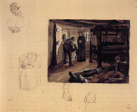
Monday Match: Grim Edition

{Every week I post an image of an interior that reminds me of a work of art either in its palette, composition or mood.}
via TLC Home
Käthe Kollwitz, The End

Wednesday, November 2, 2011

Creative Economy

I confess that I am a maximalist at heart. Cakes should be layered. Speech should be flowery. Colors should be mixed with abandon. 

Still, there is something so appealing about chipping an idea down to its essence.

Constantin Brancusi's 'Bird in Space'

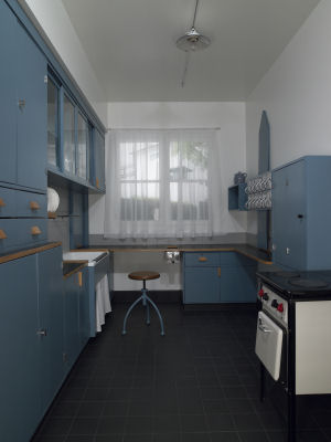
There is satisfaction in knowing that there are no extraneous elements in a design.

The Frankfurt Kitchen

And there is a power in the economy of expressing something extremely complex with a simple gesture.

Michelangelo's 'The Creation of Adam'

Tuesday, November 1, 2011

Art and Advertising

while we're on a Manet kick...
Édouard Manet, Olympia
ad for The Cosmopolitan of Las Vegas
Related Posts Plugin for WordPress, Blogger...