 |
| (first seen: http://www.missmoss.co.za/2010/04/30/cafe/#more) |
Slush and freezing rain around here have me daydreaming of being back in Paris, sipping a coffee outdoors, and well..staring at people. If you ask me, the French have things figured out in that department. In America, our chairs face individual tables, but in my humble opinion, you just can't beat a chair turned purposely toward the street. I mean, who doesn't like to people watch? It 's just a better design model for sidewalk cafes.
 |
| (image via econoclasm.blogspot.com) |
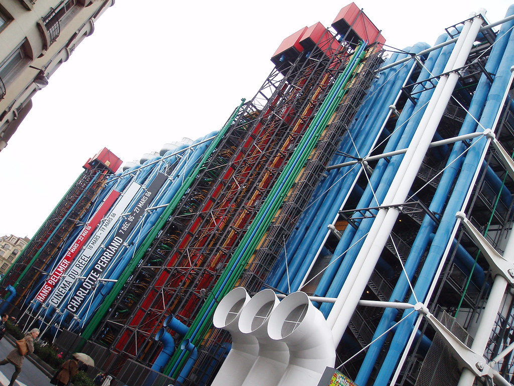
This winter we ripped the ugly drop ceiling tiles out of our basement, and decided to paint all the duct work instead of having it drywalled over. I looked at the pipes and the enormous heating vent branching toward all corners of the house, and couldn't help think that most standard-issue houses must have been built with the design of the human body in mind. The furnace pumps air and warmth to all the rooms, the pipes carry water in and out -- you get the idea. Unlike the Pompidou, they feel like living spaces.
Maybe it's the fact that I'm reading Loving Frank that has me thinking about the concept of form following function, but whatever the reason, these examples have me convinced that some design models just plain make more sense. Are there any models for things or places that you think work better than others?

No comments:
Post a Comment