Monday, February 28, 2011

Why Didn't I Think of That?!

image via
 Friends, my life has changed for the better! Above is a standard palette, probably laying flat on a table next to an easel. I've been painting with this set-up for as long as I can remember. The problem is that this causes a delay between mixing a color and applying it to the canvas.

via 


Enter the vertical palette! Why have I not thought of this before?! I read an article about David Kassan who uses an arrangement in his studio similar to the one in the picture to the right. (I wish I could find a picture of his actual palette to share.) Anyway, he has a glass insert set onto a backing toned the same color as his painting surface, and propped on an easel beside his work. Brilliant!

As soon as I reach a good stopping point with a few of the projects that I'm working on, I'm going to make a vertical palette of my own!

Monday Match

via

Mary Cassatt "The Coiffure"

Monday Match: Urban Green Edition

Wayne Thiebaud
via: miss moss

Friday, February 25, 2011

Happy (Productive) Weekend!

Friends, I don't know about you, but this has been one crazy busy month for me! I'm usually itching to run head-long into Spring, but this year the prospect of March coming in like a lion seems a lot more probable that it going out like a lamb.

My weekends are going to look a lot more like my weeks for the foreseeable future. On the upside though, I have some really exciting projects lined up for the next few months, and as Thomas Jefferson said "A mind always employed is always happy.  This is the true secret, the grand recipe, for felicity."

Thursday, February 24, 2011

Little Fish in a Big Pond

http://little-people.blogspot.com/

I love these little people. Imagine going about your day and stumbling upon one of them! They remind me that we are all little fish in a big pond.

Wednesday, February 23, 2011

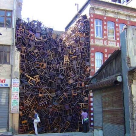
Abandoned Lot or Prime Real Estate?

Sometimes it is what is between the "important" information in a work of art that really packs a punch!


Sculpture Doris Salcedo stacks over 1,550 chairs between two buildings via
This concept spans across artistic forms. I just learned about Derek Attridge's idea of "unrealized/virtual beats" in poetry. To say it simply, these are rests in a four beat line. They act like actual beats even though they are really silences between words.

I had almost forgotten (rest)
That words were made for rhyme: (rest)
And yet how well I knew it -- (rest)
Once upon a time! (rest)

(This example is of a Christopher Morley's poem from The Anthologist)

via
One of the most spectacular examples of this idea in dance is STOMP. Have you seen it? You should. It's kind of indescribable, but basically involves choreographed percussion, extreme movement and everyday objects. Its basis is beat, but its pauses make those beats all the more powerful.

John Singer Sargent


One of the first lessons a visual artist learns involves the concept of negative space or the "blank" areas between the subject of an artwork and the image edge. It takes a surprising amount of skill and courage to concentrate as much on these spaces as on the subject itself, but doing so can energize an otherwise simple artwork. Sargent chose to turn the potential "abandoned lot" of the background in this painting into "prime real estate."  By fusing the darkness of the background with the negative shapes of the shadows on the figure, he creates the essential drama of this piece. The "empty" areas are at least as crucial as the detailed sections.

Tuesday, February 22, 2011

Still Waters Run Deep

I love when a work of art invites closer inspection of its working components. Here are some of my favorite examples of art that is more than what it seems:

Posterity- The Holy Place Damien Hirst
Hirst used butterfly wings and high-gloss house paint to create the above reflection on life and death.

Real Life is Rubbish Tim Noble and Sue Webster
Nobel and Webster piled and lit ordinary objects to reveal these shadow silhouettes projected from the original "rubbish" stacks.

Fanny/Fingerpainting 1985 Chuck Close
Chuck Close used his inked finger prints to create this enormous piece. I remember being fascinated by it as a little girl visiting the National Gallery. My admiration for Close only increased after visiting his exhibit at the Corcoran this fall. His quote at that show sums up his process for me:  

"As a kid I loved magic, but I used to break the cardinal rule of the magician. After I did the magic trick, I would go back and show everyone how I did (it)...It's supposed to ruin the experience but I found it didn't. You could show them how you did it and they would still be amazed."

I think that these seemingly straight-forward works mirror the intricacy of the human person in a unique way through the surprising articulation of their material parts. 


Wednesday, February 16, 2011

3-D, Risk and A Life of Adventure

When I was waiting tables to pay tuition bills in college, one slightly intoxicated patron proposed marriage to me with a paper napkin ring and the line "I'll promise you a life of adventure!" While I ultimately declined his offer, I have been impressed with the sentiment ever since. 
In an era when work demands so much of most of us that life becomes one-dimensional (job, job, and more job), we rely heavily on such things as social media, i-phone apps, and 3-D entertainment to round out our lives. To offer an overly simplified and slightly cynical-sounding overview: Facebook allows us to maintain friendships without the commitment of real interaction. Apps streamline our efficiency to produce time we don't have. And now movies are literally adding a couple of dimensions to the entertainment side of things. 

With all of these inventions we are striving to make LIFE feel more ALIVE.
via
 Now don't get me wrong, this girl loves her modern, gadget-using life as much as the next person, and is not advocating for the overthrow of any and all things tech (this is a blog after all!) No. These things make life easier and sometimes more fun. The problem is that none of these things involve the risk that gets our heart pumping in real life. We quell the nagging sensation of dullness that comes from an easy, entertaining but adventure-less life by telling ourselves that we don't have time or energy to meet someone new, go to the gym, bake cupcakes, fight for something worth fighting for etc. But are we as satisfied? Have we stood on the edge of a real-life cliff and said "Here goes nothing"?
via
 My absolute favorite book for artists is Steven Pressfield's "The War of Art". Pressfield cuts the sweetsies, tells you to just put on your brave face and jump...artistically. (To give you an example, he  says in his intro regarding Hitler's failed artistic career "Call it an overstatement but I'll say it anyway: it was easier for Hitler to start World War II than it was for him to face a blank square of canvas.")
Norman Rockwell
I'm with Pressfield. We all need ease and entertainment, but nothing satisfies like the thrill of risking something to live the adventure.

Tuesday, February 15, 2011

Party and Pong


Tomorrow night from 6:30 to 8:30 Nathaniel Pearlman (www.timeplots.com) and I will be having a casual reception for the little art show we have hanging at Politics and Prose. Stop downstairs in Modern Times Cafe for some art and conversation! Then join me afterwards for some beer and ping pong next door at Comet!


Monday, February 14, 2011

Monday Match

photographer Anita Calero's West Chelsea loft via
"The Fifer" by Manet
Ready for a match that takes a bit more right-brain muscling? The color palette of crimson, gold, ocher, putty and slate (with pops of crisp black and white) is an obvious starting point. Now check out the way the pointed overhead light fixture mirrors the fifer's cap, or the way that the lamp next to the bed is raised at almost the exact same angle as his fife! Both the interior and the painting combine playful mood with refined textiles for a not-too-serious elegance.

Friday, February 11, 2011

Happy Weekend!


Here's hoping that Monday's sweetness begins this weekend for you all!

Thursday, February 10, 2011

Be Mine


Is any one else getting seriously pumped for Valentines Day?! Yeah, Yeah, I know it's a commercial holiday and all, but my mom always went all out with a handmade card and treat for my sisters and I when we were little, and well...I've loved it ever since!
via

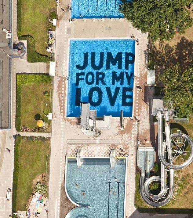
This work found on the Wooster Collective site would make a pretty sweet substitute for the heart doilies on Monday! In their words "This site is dedicated to showcasing and celebrating ephemeral art placed on streets in cities around the world." I love the idea that this was probably done before anyone arrived, and would only be visible from the high dive -- like the modern equivalent of the gothic cathedral gargoyle.

Wednesday, February 9, 2011

Wow

(National Geographic via pintrest)
Talk about Life imitating Art! Sometimes nature is just about the most incredible source of inspiration out there! I have been spending a lot of time recently considering the theory that there are no new ideas, just new combinations. What do you think?

Tuesday, February 8, 2011

The Death Of Print, Designer Groceries, and the Flat Portrait

Are you ready for a super long post? (No? Check in tomorrow and I promise to keep it sweet!)


via
Friends, no matter how you spin it, it is impossible to ignore the demise of print media these days. Forget the ancient practice of communicating via the written word (think snail mail letter), we now also get the bulk of our news, entertainment and inspiration online. Brittany Watson of The House that Lars Built explores the way in which the design world in particular is impacted by the shift from printed magazine to blogs and other online resources. Her masters thesis project for the Corcoran College of Art and Design draws information from a series of questions which she posted on this subject. (The whole thing is brilliant and you should really go check it out for yourself.)
via
What struck me most about this project was that while most people appreciate the plethora of inspiration made available by the growing digital design world, many also agree that nothing beats a good design magazine. In other words, while it's comforting to know that there is a heck of a lot of information available when one wants to source it, what one really enjoys is a curated experience.


...which brings me to the subject of the boutique grocery store. Sure Costco may have the cheapest deals in town, and Walmart is going organic, but it just feels so much more satisfying to select your rainbow chard from the among the carefully arranged bunches at, say, your neighborhood Whole Foods. (That is if you can't pick it yourself from the closest farmers market or farm itself!) Setting aside the politics of choosing one store over another, what I mean to say is that the more tailored an experience seems to be, the more enjoyable it is. The subtext here being that choices have already been made so that we can be free to enjoy an already edited selection (kind of like the design magazine vs. the bottomless inspiration of the blog world.)


Allie Rizzo by Man Sumarni for FN Magazine Feb 2011
And so we come back to my preference for portraits painted from life vs. from photographs. While it is not impossible to use a photograph merely as a reference, there is a danger in representational work relying too heavily on the information that a photo provides. Artist, Michael Malm, is quoted in American Artist Magazine as rightly noting that "it helps to paint from life...because when (artists) only use photographs they have a tendency to paint every detail the camera records." The resulting painting is one with a ton of information but zero life. Conversely, through the process of simplifying and selecting what to show in a work of art, an artist avoids the flat portrait by acting as communicator of something worthwhile vs. just a recorder of a bunch of random information.

Monday, February 7, 2011

Monday Match

 designed by Myra Hoefer
"Flaming June" by Frederic Leighton
If this room were a painting it would have to be "Flaming June!"

Friday, February 4, 2011

Happy Weekend!

via National Geographic
In between commissions (mostly on Saturdays at this point) I've been hard at work on a series of psychological portrait installations, which I plan to share with you all late this Spring. I'm a strong believer in casting a wide net for ideas, so in that vein, I'm soliciting your help. I'm starting to look for a publicly-accessible space (in the Washington, DC area) to show this series -- ideally something that doesn't feel overly gallery-like, but allows a good amount room to move around. Oh and somewhere that non-invited people feel comfortable just wandering in, i.e.-- a high foot traffic area. Any suggestions would be much appreciated! Have an inspiring weekend everyone!

Thursday, February 3, 2011

Short and Sweet

Maia Flore
Friends, I'm feeling a bit worn down today. I had one of those days that even a steady stream of coffee can't fix. In fact it may have made my hand a bit shakier in the studio than was helpful...Oh well. Sunnier skies (and meatier post) tomorrow, I hope!

"The artist and architect Didier Faustino's Doubling Happiness turns a billboard into a swing set. Rather than prompting passers-by to purchase something, it simply asks them to play." via www.good.is

Wednesday, February 2, 2011

Fragile Flexibile Things

I've been thinking a lot today about the fragility of life. It's so easy to feel like we have control over our lives, or at least have a pretty big say in how they turn out. Without even realizing it, we tell ourselves that bad, scary things happen to people who don't plan, don't care, or don't watch their backs. So we exhaust ourselves scrambling to get our lives in perfect order. Then, out of the blue, we or someone we love, experiences something CRUSHING, and all of a sudden life looks painfully fragile.
I adore the Coen Brothers' "A Serious Man," in which the final scene drives this message home.

So I started thinking of fragile things that are able to withstand hard blows, like houses built on stilts in earthquakes zones and such, in order to shift with the earth's movement, and not end up with cracked foundations -- homes rolling with the punches, their strength lying in their flexibility.
via


 or horses' knees as natural shock absorbers because of their ability to bend in both directions.

or the super complicated structure of a spider's web, which allows air to pass through the spaces between its elastic fibers without snapping the web.  

These are things that appear breakable or unstable, but actually have a type of strength based on flexibility. No one wants to snap, but life is fragile, and the best examples of resilience seem to be based on flexibility.

Tuesday, February 1, 2011

Pull Up a Chair and Stare: Design Mirroring Function

(first seen: http://www.missmoss.co.za/2010/04/30/cafe/#more) 
Slush and freezing rain around here have me daydreaming of being back in Paris, sipping a coffee outdoors, and well..staring at people. If you ask me, the French have things figured out in that department. In America, our chairs face individual tables, but in my humble opinion, you just can't beat a chair turned purposely toward the street. I mean, who doesn't like to people watch? It 's just a better design model for sidewalk cafes.


 (image via econoclasm.blogspot.com)
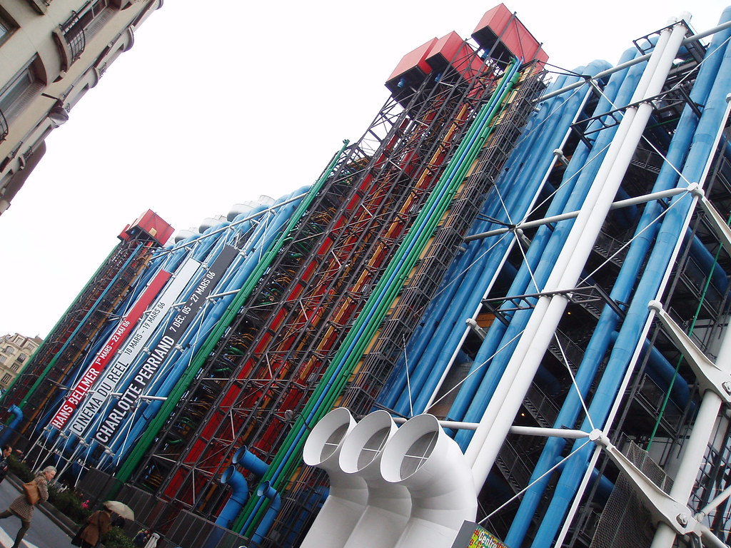
Speaking of design models and Paris, what do you think of Centre Pompidou? With all the heating/air conditioning vents, escalators and pipes on its exterior, this contemporary art museum theoretically leaves a vast interior devoted to art. I love the concept, but in reality I have to confess that it felt hallow and kind of directionless. 

This winter we ripped the ugly drop ceiling tiles out of our basement, and decided to paint all the duct work instead of having it drywalled over. I looked at the pipes and the enormous heating vent branching toward all corners of the house, and couldn't help think that most standard-issue houses must have been built with the design of the human body in mind. The furnace pumps air and warmth to all the rooms, the pipes carry water in and out -- you get the idea. Unlike the Pompidou, they feel like living spaces. 

Maybe it's the fact that I'm reading Loving Frank that has me thinking about the concept of form following function, but whatever the reason, these examples have me convinced that some design models just plain make more sense. Are there any models for things or places that you think work better than others?
Related Posts Plugin for WordPress, Blogger...